With the release of iOS 7 there is an abundance of comments saying that Apple has stolen ideas from Android and Windows phones. I can see some similarities in the designs but I cannot see that Apple have copied anything due to a lack of imagination. Sometimes there is just an ideal way of designing something. Apple got there first with regards to how apps should be viewed on the homepage and it's competitors soon followed.
When you have a design or function that works, regardless of who did it first then should you aim to borrow from this design or try and reinvent this aspect, even when it may be inferior?
When Apple sat down to look at the iOS 7 redesign some aspects will have naturally fallen into place, some things should just go in a certain place. I admit I have very little experience using Android phones so I am basing these observations purely on what has been posted across the net.
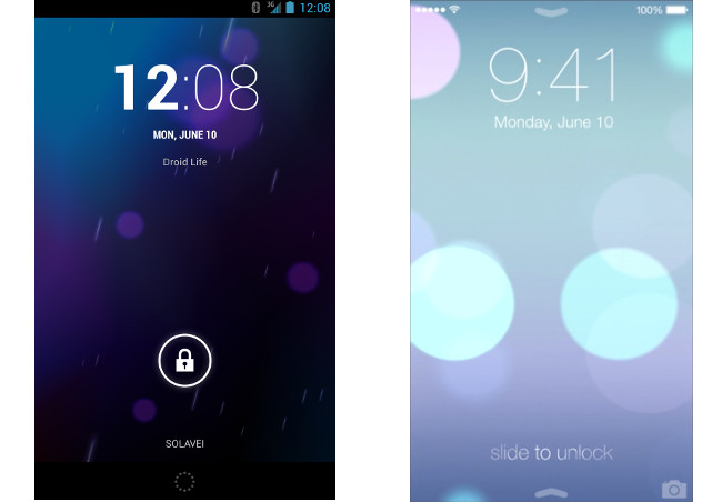
For example, look at the iOS 7 and Android lock screens below.

Yes, they do look very similar but take a minute to think about how few details are shown on the lock screen. Each of these details are in a position that makes sense, to place them anywhere else would not make for good design.
Lets take a look at the main design features of this lock screen. First, the top bar. This always consists of the battery life, mobile signal and Wi-Fi, these are always at the top of the page, this is nothing new. It's what stays constant through all of iOS, people expect it to be there and it is at the top on every other mobile screen I can think of. Looking at that aspect alone it is definitely not similar to Android.
Next, the time and date. So you've sat down at Apple and are given the task of placing the date and time on the lock screen. It should go in the center right? To the left or right would look silly. It's in the top center in iOS 6 and it just makes sense to place it at the top. This isn't copying, even a non-designer would surely place it in the center and towards the top.
Ok, both phones unlock at the bottom of the screen, this is nothing new, Apple did the slide unlock feature first (correct me if i'm wrong) and it has always been at the bottom of the screen. The way the two phones unlock are really quite different, it cannot be said that this was copied from Android.
The last aspect which I will say is unnecessarily similar is the wallpaper. This is too similar and should have been changed, assuming Apple even knew of a similarity. But, let's be honest, does apple really need to copy a wallpaper? Somehow I don't think that they are lacking the design skills to be able to create a new wallpaper, what would they stand to gain from copying this? Of all the things Apple could copy to improve iOS, would a wallpaper be it? It just doesn't make sense. It is entirely possible that they have never even seen this wallpaper on Android before.
So that's the 3 main features all positioned in their ideal place and in the same position as they were on the previous iOS. This isn't copying it's just common sense, especially for designers.
In this case, at the worst Apple has released an 'optional' wallpaper that is very similar to the Android one shown above.
